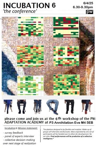
In the weeks following the completion of the survey PW Technical Support runs data analysis on the results.
For further information:
N1 – Full Data Analysis Document PDF
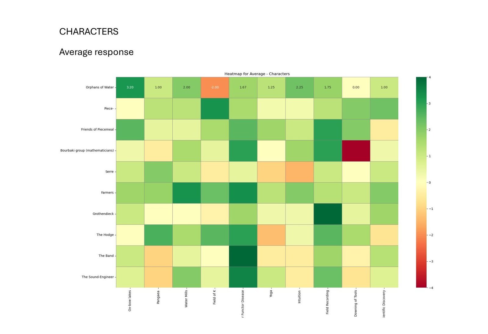
First, responses are averaged.
So, on the above graph, the average degree of interrelatedness between the ‘Orphans of Water’ and ‘Oxbow Lakes’ from a score of -4 to +4 given by the 5 respondees is 3.2 (dark green). (click on heat map to see)
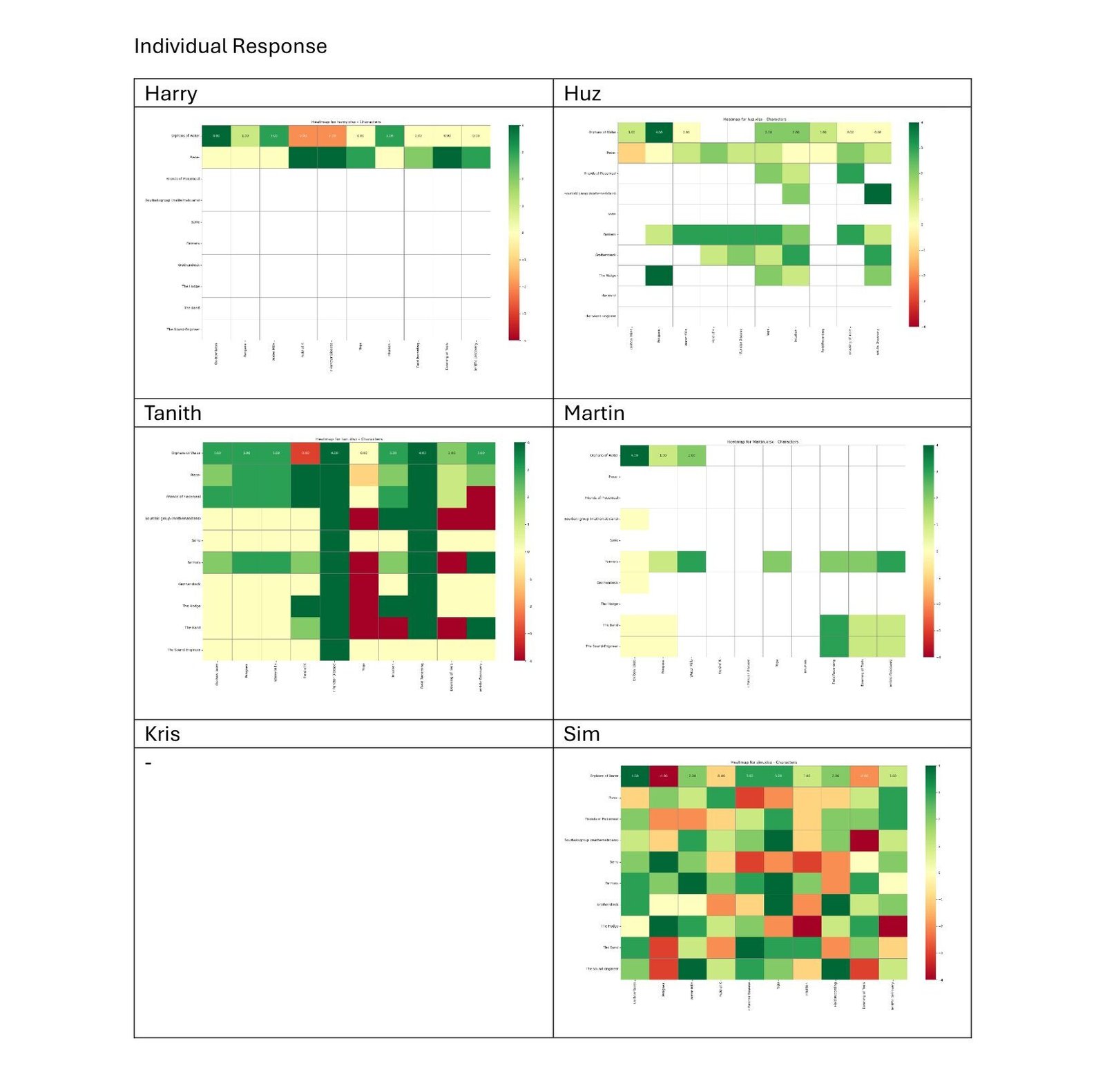
Then, individually heat-mapped.
So, on the above graph, it is possible to see that the degree of interrelatedness between ‘Orphans’ and ‘Oxbow lakes’ was 4 (Harry), 1 (Huz), 3 (Tanith), 4 (Martin), 4 (Sim).(click on heat map to see)
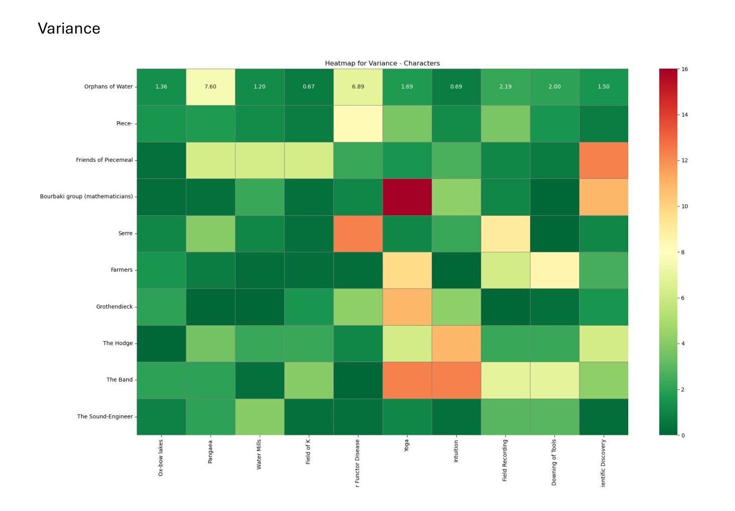
Another graph is created showing the degree of variance between survey answers for each score.
So, on the above graph, there is a low degree of variance between answers about the interrelatedness of ‘Orphans’ and ‘Oxbow lakes’ – a score of only 1.36 (dark green) – meaning respondents agreed with eachother. However, dark red square for ‘Bourbaki Mathematicians’ and ‘Yoga’ represents a high degree of variance, and alot of disagreement about the interrelatedness of these two elements in the Configurations.
A Conference is Called
A slide-show is created and an expert panel is arranged to report back the results of the survey to the public and collectively decide the future of the Configurations.